Please note: This article was originally written more than five years ago. Research and understanding of autism continue to evolve, and some terminology or interpretations in older articles may no longer reflect current perspectives or best practices. We have retained this article for historical and educational purposes while continuing to update newer content as research develops.
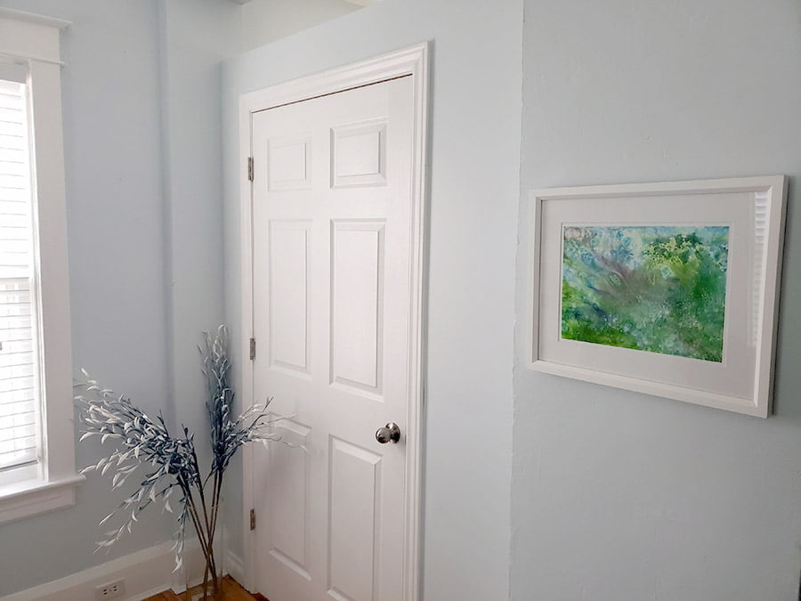
This morning Natalie and I had an argument about the color of our living room. She insists it is light blue, whereas I insist it is pastel green. Maybe you can help us settle the debate?
The living room
Here is a picture of part of our living room (featuring a piece of art by Iris Grace, a gifted autistic girl).
The couch
And here is the next point of contention. Natalie bought this couch, the blanket, and the boxes of Kleenex because they are all blue, so they would match the room. Are the couch and blanket blue though? I agree they match the living room, because to my eyes they are a pastel green. Or to be more specific:
- The couch is a pastel green/grey. Probably celadon. The lines of the pattern are beige or off-white.
- The blanket features grey, a pale pine green (approximately), and white.

The Kleenex boxes, I agree, features medium blue on top, with information within a light blue/cyan panel—the same color as the circles containing the Kleenex logo on the sides of the boxes. But Natalie thinks the 2nd and 5th box from the top are blue, while I think they are a pastel green/cyan.
Natalie is vehemently against the idea
that the living room and couch are green.
Different perceptions
Natalie asked her assistant what color the living room and couch are, and she said light blue. What a relief for her! They both joked about how I might be color blind. I know I’m not though, because I never had any issues on color tests. But I did wonder, might there be a gender difference in how we perceive color?
Next, I thought maybe there is not a difference in perception per se, but a difference in what name we attribute to what color. Because of course, there is a spectrum between blue and green, and it’s not at all clear at what point on that spectrum blue should be called green instead (or whatever color in between we may choose to attribute a discrete name to). This is the issue with discrete terms to refer to a spectrum aspect of reality—or rather our perception thereof. There is likely going to be disagreement about this irrespective of potential differences in color perception!
Either way, two people agreed that the living room is light blue, and so I was the only one insisting on green. I protested with confidence, thinking as a graphic designer I have a better understanding of color (not that there aren’t color blind graphic designers though), and speak about it with more nuance. But I had to find a way to know for certain whether our living room is more blue or green, and I suppose having two people disagree with my judgment, there might have been a slight doubt about whether our living room is actually green.
Might my perception be off? Or might the language I use to describe the colors I perceive be off?
Color guide
Because Natalie is streetsmart, she looked for the color of the living room in the paint color guide she and I had acquired earlier to help us select a color for the bathroom. And there it was: Streetwise. We should have known that would be the name of the color.
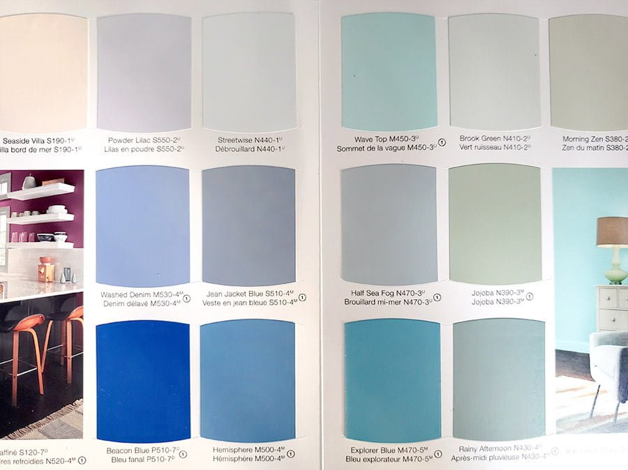
As you can see, Streetwise is on a page together with blue tones, next to a page with green tones. Maybe I was wrong after all? The fact that Streetwise was positioned next to a pastel lilac and a pastel tan didn’t make it immediately clear that Streetwise is indeed a blue tone, however.
Brook Green on the other page is clearly a pastel green, but to my eyes, our living room looks like a more toned-down version of that. Natalie was horrified by the idea.
Color online
So I looked up Streetwise online, which is the following color:
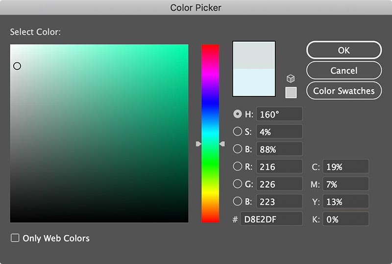
The page indicates that to represent this color on your screen, it has to have the following RGB value:
R: 216 G: 226 B: 223
Do you see that? Three units more green than blue! I was right! Natalie exclaimed, “See, that’s another super power! You can distinguish a three-point discrepancy in colors!” In the image below you can see the RGB and CMYK values for Streetwise, and you can clearly see it’s in the green range (a gray with a slight jade green hue)—right before turquoise and cyan.
Sex differences
I’m not sure if I have such a powerful ability to distinguish between colors, however. And I thought that tetrachromacy—the condition of possessing four types of cone cells in the eye, or possessing four independent channels for conveying color information—only manifests in women.[1]Richer color experience in observers with multiple photopigment opsin genes[2]Tetrachromats Research from 2010 indicates that as much as 12% of women may have tetrachromatic vision.[3]The dimensionality of color vision in carriers of anomalous trichromacy
But there are also some more general sex differences. Two related studies from 2012 lead by psychology professor Israel Abramov indicate that males have greater sensitivity for rapidly moving stimuli and for fine detail,[4]Sex & vision I: Spatio-temporal resolution whereas females are better at discriminating colors.[5]Sex and vision II: color appearance of monochromatic lights So maybe Natalie and her assistant got it right after all?
Paint technician
We went back to the store to get paint for the bathroom, and I asked the paint technician what colors Streetwise consists of. She told us it contains blue and amber.
Maybe on account of being quite overstimulated by all the details, colors, and textures in Home Depot, I deemed this answer satisfactory at the time, and didn’t think to inquire about the actual ratios. But at least I knew the paint contains amber (i.e. yellow-ish), which of course pulls the blue towards the green end of the spectrum.
Soothing light blue
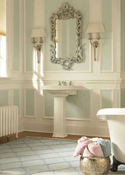
Back home I realized I still had no clarity on whether Streetwise is blue or green, so I had another look online to see if I could find out how much of blue and amber is in there. I couldn’t find information about this, but I found the image below, which is being described on Pinterest as soothing light blue.[6]BEHR Streetwise room | Pinterest
Is it blue though? IS IT?
I realize photographs will not offer more clarity on the matter, as the lighting of the room has an effect on how the colors appear in the image, as well as how the image has been processed. I had some concern that how I processed the photograph I took of our living room would reflect my personal bias. However, comparing the image of our living room with the image of a bathroom above, due to how the colors appear in proximity, now I would probably say our living room is a soothing light blue, while the room above is definitely pastel green!

On the one hand, I have hereby admitted defeat by stating our living room is a soothing light blue after all; while on the other hand, I have never been so certain in my life that the color of the bathroom is pastel green!
And yet I would be wrong. In the image below, you can see a gradient going from the main color I selected from the bathroom image (left) and from our living room (right). I would argue now we are seeing a transition from light brown to grey. No pastel green to behold!
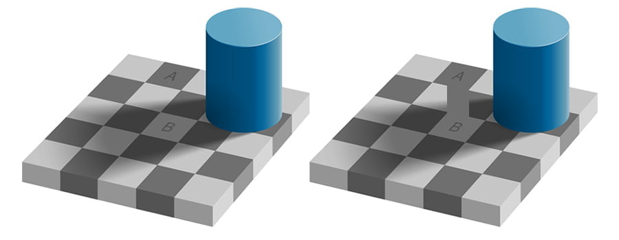
I suppose I am saying Streetwise is both blue and green—as well as different colors entirely—depending on lighting and context, and even depending on what color you might place next to it (referred to as simultaneous contrast). As Edward H. Adelson, the American neuroscientist and professor of vision science at MIT demonstrates with his checker shadow illusion (see the image below), we tend to be very poor at judging colors and tones correctly depending on context.
Color technician
So we know that the RGB values of Streetwise point to it being more green than blue, and we know that there are issues with color perception and the language we use to describe colors. What else can we rely on?
It dawned on me that I could contact a color technician from Behr (the paint producer) and ask them what Streetwise consists of, and in what ratios. And so I did. Initially protective of their formula, after I told the color technician what I have been up to, she offered me the following:
1-Gal
EL-32
LL-160
She told me that Streetwise consists of a white base, mixed with thalo blue (LL) and raw umber*(EL), so not ‘amber’, like I thought the paint technician at Home Depot said. So as you can see, the paint color features more blue than umber. I asked her how both colors relate to the white base, as it’s not clear to me what the numbers in the formula mean. She didn’t have that information for me, but I figured it wouldn’t change the blue–umber ratio anyway. I guess Natalie and her assistant were right after all! My vision of having tetrachromatic vision was in ruins.
Nevertheless, at this point, I was satisfied knowing that the paint contains more blue than umber.
Blue after all?
Was I satisfied though? Of course not! I wanted to try one more thing out. We know that Streetwise contains more thalo blue than raw umber, but how does raw umber affect thalo blue? To see how both colors mix, I used the RGB value of thalo blue and umber (I cannot find anything on a color called raw umber) and made a gradient between the two colors.
No green appears anywhere! Natalie told me that the amber/umber at Home Depot which was used to mix Streetwise looked like amber rather than umber, so maybe raw umber does indeed look more like amber, which is to say more yellow than brown.
With a lighter and more saturated hue, how both colors mix together changes. You can actually see the transition between the two colors shift now; whereas thalo blue mixed with umber seems to transition to umber towards the right of the gradient, if you mix it with amber the transition appears to occur in the middle, which I think reflects a more balanced tone transition. Still no green to be seen anywhere though!
To get green in the middle, I would have to use a lighter blue with more cyan. But maybe it’s better to follow the formula of Streetwise and add white instead of choosing a different primary color. So in the image below, I added 80% white.
Again, there is no green to be observed. I inspected the gradient closely to see if any of the hues in the middle actually constitute green, but I cannot find it; it seems to go from light indigo to grey to beige. So in terms of paint colors and the mixing process, Streetwise is definitely blue rather than green.
Blue or green?
We saw that the RGB values of Streetwise indicate it’s in the green spectrum, so why does the paint mixture of thalo blue and amber/umber not result in any green hue?
The difference is to be found in the color mixing methods used. RGB is based on additive color mixing, meaning one set of wavelengths is added to another set of wavelengths to produce more colors; the base colors red, green, and blue in dual combinations produce yellow, cyan, and magenta, and combining all three results in white.
Paints, inks, dyes, and the printing process are based on subtractive color mixing, meaning new colors are produced by the removal of wavelengths from light with a broad spectrum of wavelengths. Here, the base colors cyan, magenta, and yellow produce other colors, while all three primary colors combined produce black(-ish). In printing black (key) is usually added to produce true black.
To produce green in RGB, you can just use the primary green, and when you combine green and blue in equal measure, you produce cyan. If you add red as well, not only do you end up with a much lighter color, but it pulls cyan towards yellow (becoming more jade green than cyan) and grey.
To produce green in CMYK, however, you need to use cyan and yellow as primaries. But Streetwise does not consist of cyan and yellow. Instead, it uses thalo blue (which is a combination of cyan and magenta) and umber/amber (which is yellow mixed with magenta and some cyan). So both primary colors used to mix Streetwise are already quite dark and complex (i.e. mixed with the CMY primaries), and mixing them results in dark blue, dark grey, or dark brown, depending on the mixture. To lighten the color, a lot of white is added (or rather some thalo blue and umber pigments to the white base), and you end up with a very light grey with a tinge of blue, which might be ever so slightly pulled towards green due to containing some yellow. So why did we not actually see any green tones in my color experiments above? I think because I am trying to reproduce subtractive color mixing by using technology that is inherently based on additive color mixing.
If you have a more technical explanation for this discrepancy, I would be eager to hear it!
Color perception
But irrespective of the color mixing method used, why do so many people (the paint and color technicians included) say it’s in the blue spectrum? Why do I seem to be one of the few who says it’s pastel green?
Earlier I briefly talked about two studies from 2012, which indicate among other things that women tend to be superior when it comes to discriminating colors. What Israel Abramov et al. also found is that men and women tended to ascribe different shades to the same objects.[7]Sex and vision II: color appearance of monochromatic lights The researchers suggest that males require a slightly longer wavelength across most of the visible spectrum than females to experience the same hue. Since longer wavelengths are associated with “warmer” colors, an orange, for example, may appear redder to a man than to a woman.[8]Men and Women Really Do See Things Differently | National Geographic The studies also indicated that men are less adept at distinguishing between shades in the center of the color spectrum: blues, greens, and yellows.[9]Sex and vision II: color appearance of monochromatic lights Oh, what a surprise!
So rather than having tetrachromacy, according to the study, I am actually most likely porer at distinguishing between blue and green in the first place! Not only that, but because I likely see colors as warmer than Natalie and her assistant do, for me Streetwise is slightly pulled towards the yellow part of the spectrum, meaning I see green where Natalie might genuinely see blue!
Although I have come to the conclusion that Streetwise is technically blue, I can’t help but see a pastel green. But it seems color perception is even influenced by logical reasoning about it, because after this investigation into the color of our living room, Natalie can now no longer see our living room as anything other than green, either!
She doesn’t like it one bit.
Whether blue or green though,
I love our living room!
Comments
Let us know what you think!