In the previous post, I announced our name change. Besides the new name, you might have noticed a few other updates. Whether you have or not, let me just briefly mention the most significant ones.
New post layout
You might have noticed that the layout of our blog posts has changed quite considerably:
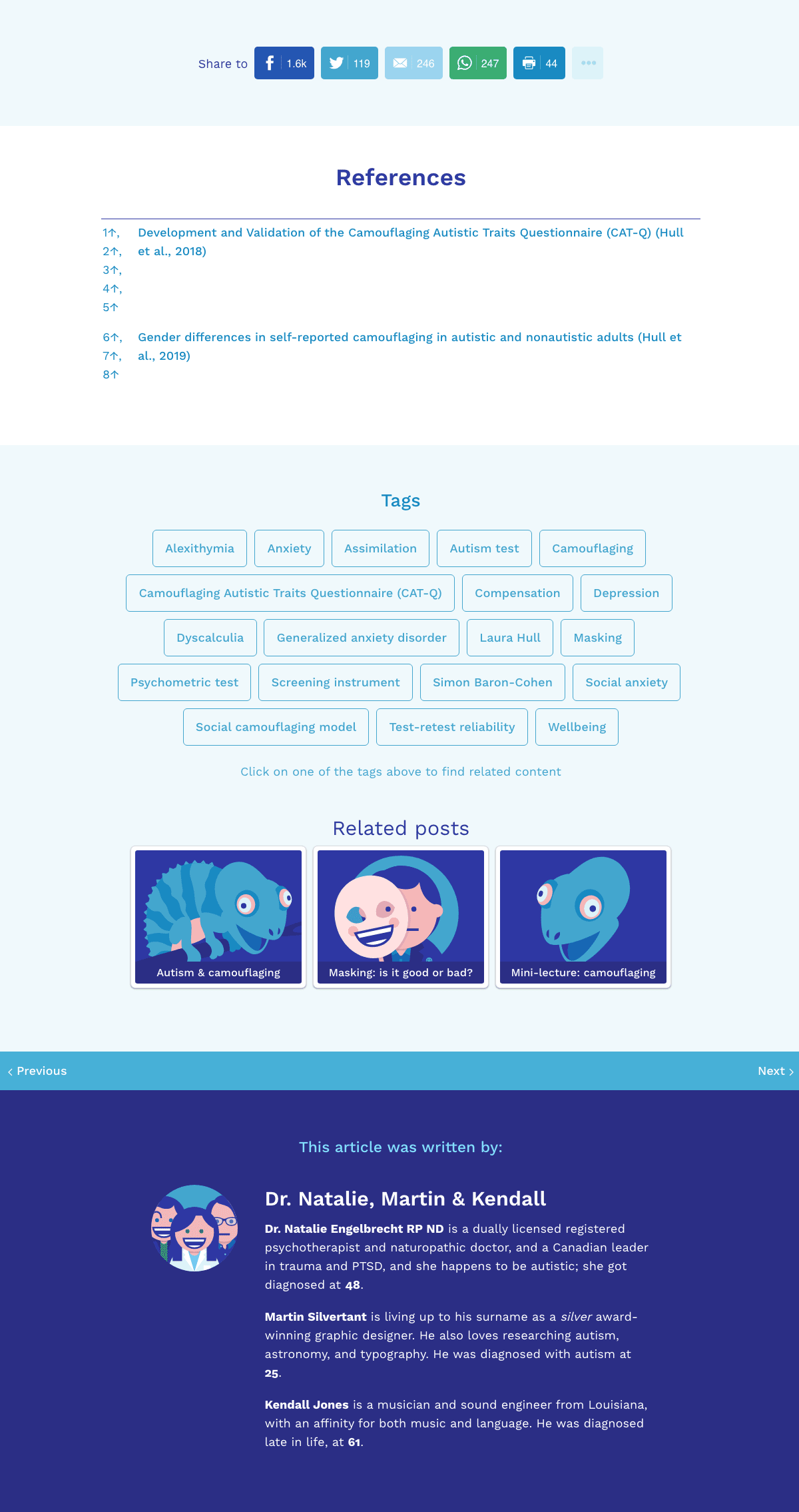
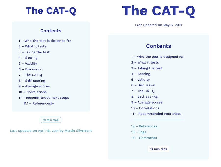
- The table of contents section looks more refined and has a better division of content (listing references, tags, and comments separately from the main content).
- The styling of large links in posts has been improved, so they now look more obviously like links rather than blue titles.
- The social sharing icons at the bottom of posts are now in their own section, distinct from the post.
- The references section has been upgraded, with fancier link hover effects, and the section is better distinguished from the main content.
- The tags and related posts are now together in one section, and the tags are displayed a lot more prominently, to encourage exploring our content of related subjects.
- The author’s description is displayed more prominently and with more spazaz. You gotta have spazaz! Oh, and the author name now links to their author profile, where you can find more of their posts.
- And finally, the comments section is now looking a lot better. You now have fewer excuses not to comment. Let me know what other excuses you have to not comment, by leaving a comment in the upgraded comments section below.
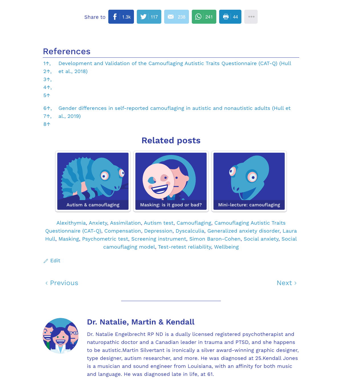
For reference, below is a screenshot of the old blog post layout—the sections below the main blog post.
In the screenshot below, you can see what it became. As you can see, the layout is better divided, more color is used for emphasis and visual impact, and I think the end result is a lot more clear and appealing.
And below is an update that would be hard to notice without reference, but which definitely makes things look more clear: a more refined table of contents!
New illustrations
Some of the illustrations have been updated, such as Natalie’s character on the home page. Below is a screenshot of the old page, in case you would like to compare.
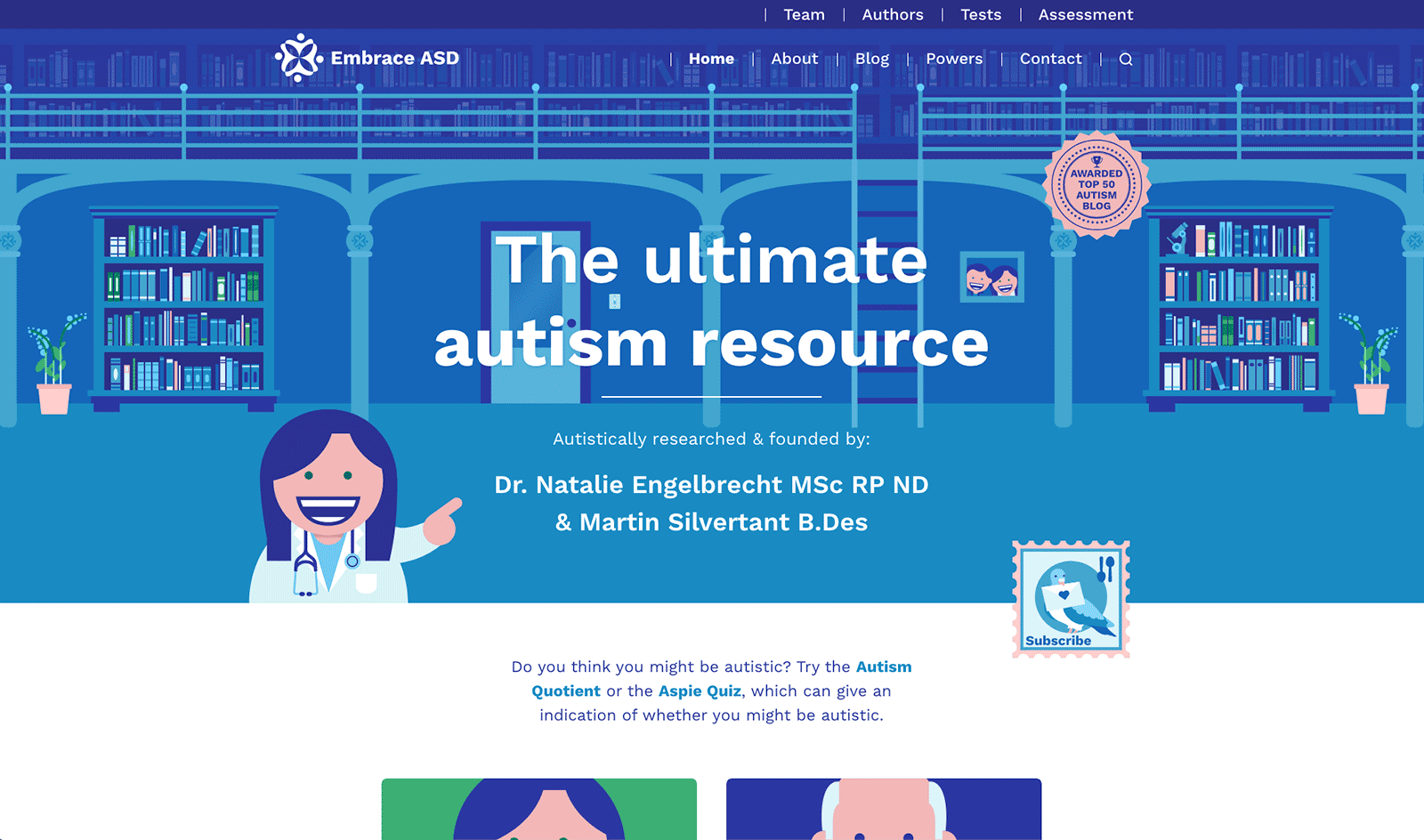
Below is the updated home page design, with Natalie’s new character, and cooler typography.
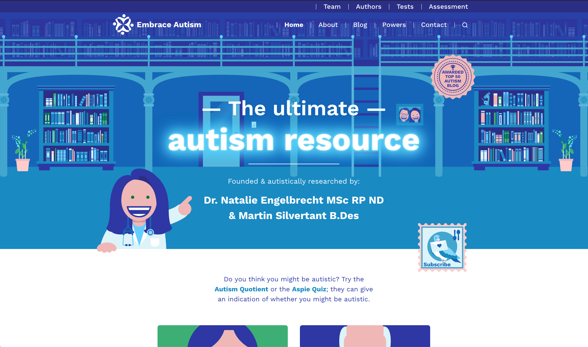
And have you seen the new artwork on the Team page?
New comment features
We implemented various new commenting features, including:
- Comment upvotes/downvotes — You can now like or dislike a comment. We might reconsider including downvotes though. What do you think?
- Mentions — Similar to Twitter, you can now mention other people using their handle. I suspect this only works if you’ve registered an account on our website though. Either way, you can respond to me in the comments using @martin-silvertant.
- Emoticons — You can now include emoticons in your comments!
- User comment profiles — By hovering over someone’s avatar in the comments section, you can see various statistics and their latest activity on the website.
- Badges — Based on your engagement on the website, you can achieve various badges.
Device optimization
We also spent more time optimizing the website for different devices and resolutions. Some layout issues were addressed, such as the Recommended next steps section at the end of our posts on psychometric tests, which went off-screen on mobile. And depending on the size of your screen, the main artwork of posts, as well as post titles, will appear larger—thus utilizing more of your screen estate if you have it. Can you imagine the possibilities of a 100″ screen? The sheer amount of autism information you could fit on that! We might optimize our website for that once it becomes commonplace.
Improved accessibility
And finally, we made a few accessibility improvements. We can do more, and we have more planned, but for now, we addressed two things:
- We made the focus state of links more obvious, which will probably aid you when navigating links using the tab key, and will probably bring more comfort to our readers with lower vision.
- We added a media query that minimizes all animations and link/hover effects on our website depending on the settings of your browser. So this will probably bring more comfort to our readers that experience issues with flashy imagery.
If you can help us make a WordPress-based website more accessible, we would love to hear from you!
Multilingual
We were going to announce the exciting news that we have now gone multilingual, but we faced too many challenges and decided to bring the updated website live without multilingual support. We will try to get that working in our next big update. However, based on a request, we did translate the CAT-Q to Canadian French, so that French-speaking clinicians in our country can make use of this fantastic psychometric test. So even though you can’t yet switch between languages on our website, you can access the CAT-Q in French here:
Le CAT-Q
And that’s it for now. Let us know what you think of the changes, or if you have suggestions on things we could implement.
Comments
Let us know what you think!