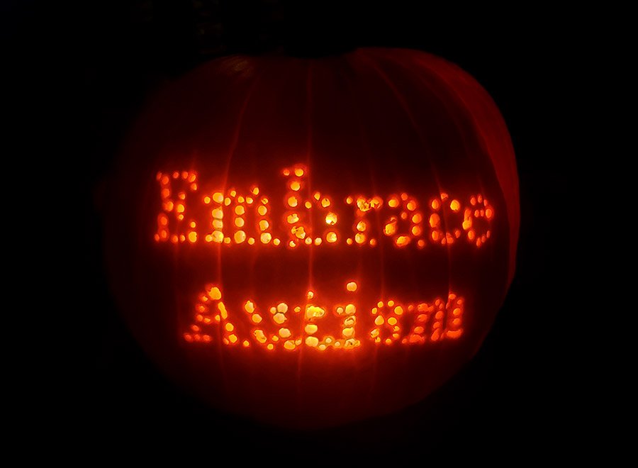
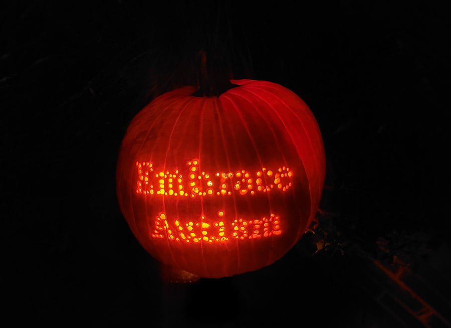
In the previous post, I showed you our Halloween pumpkin from this year. If you haven’t seen it, have a look here:
Halloween 2019
In this post, I will show you a bit of the design and carving process I went through.
Pumpkin sketches
I decided to carve out the Embrace ASD logo once again, but with a different approach. I tried to invert the design so I would be carving some of the background away rather than the logo itself, but it didn’t look nice. So I tried to expand the design. In the image below, you can see three designs I considered, the first being our logo without additions.
I showed the three designs to Natalie and asked her which she would carve out, and she chose the first one. I said, “I know, it’s strong. It’s just that I already did that last year.” Natalie suggested I set our name, ‘Embrace ASD’, in my own typeface, Astroville. Below you can see what she was referring to. The typeface is a dot-based design based on Baskerville, and the dots look quite like stars, hence the name.
I thought it was a great idea to use text, but I decided to make it say ‘Embrace autism’, figuring it might have some value to be shared, whereas a pumpkin with our name will probably not offer that incentive. But I was a bit hesitant about using Astroville. Yes, it will look amazing to see the light from inside the pumpkin come out of all those holes (I originally designed the typeface for a project involving a lamp with the same principle, so I knew it would look great) but I worried the holes were going to be too small.
Below, you can see how delicate the design is. It doesn’t offer a lot of contrast! Next to it, you can see a stencil design I tried based on the typeface we use for Embrace ASD in general, which is Work Sans.
Natalie dismissed the stencil version of Work Sans, and insisted we should try Astroville, as she felt it will look amazing. She looked up videos on YouTube about using a drill to make cool pumpkin designs. So I measured our pumpkin and printed ‘Embrace Autism’ as big as possible, but not so big that the text would be greatly distorted under the curvature of the pumpkin. I cleaned the pumpkin (horrendous job, horrendous smell), taped a cutout of the print on the pumpkin, and I started drilling!
Results
I used different drill bits for the holes of different sizes. It didn’t seem to be going very well, but I decided to just finish the job before I would remove the now half-deteriorated print and see what’s underneath. Well, it’s not perfect, but the results are pretty cool! 

Halloween typefaces
Lastly, if you are interested in typography, you will probably enjoy my article on two awesome typefaces that are quite suitable for Halloween among other things:
Comments
Let us know what you think!