
Let’s not skip over the fact that indeed it is no longer Sunday. It is barely even Monday anymore, and it will probably be past midnight by the time I post this.
What happened is that I thought I posted this yesterday, but forgot because I got distracted by a panic attack, followed by a major meltdown, and a consequent PTSD flashback. The flashback is something I think I experienced just once before, and it’s a truly bizarre and quite nightmarish experience. I might write on it, although I am not sure there is much to say. So I might not. But then again, maybe it’s worthwhile to share some of what it’s like to have a meltdown, and the amount of dissociation seems to be involved as I suppress rage which turns to shame. Okay, maybe there is plenty to talk about, but another time. My mind is mush right now.
I’m also a bit frustrated that I couldn’t have done the meltdown today rather than yesterday; it somehow seems appropriate for Sensory Sunday to be followed by Meltdown Monday. After all, sensory overload can lead to meltdowns.
Question
We had already established the question Sunday morning, but in light of the meltdown I had, the question is a bit ironic now. Maybe that makes it more exciting? The question is:
Are you a ‘sensory craver’?
If so, what sensory experiences do you seek out?
My experience
Generally, I suppose I avoid senses more than I seek them out; I like to stay at home as much as possible, and I keep my work environment dark, as it’s easier on my eyes. At the same time though, I am probably a sensory craver mostly in the visual domain. Being a graphic designer, I love to look at the word in terms of composition, shapes, colors, textures, details, etc. Or rather, because of my focus on these things, I became involved in graphic design. Of course, virtually anyone with visual perception sees shapes and colors. But I am perpetually browsing for those shapes, colors, details, etc. In particular, I very much enjoy looking at type/lettering. Perhaps my fellow type designer Erik Spiekermann can give more power to what I am talking about:[1]Helvetica (2007) quotes | IMDb
I’m obviously a typeomaniac, which is an incurable if not mortal disease. I can’t explain it. I just love, I just like looking at type. I just get a total kick out of it: they are my friends. Other people look at bottles of wine or whatever, or, you know, girls’ bottoms. I get kicks out of looking at type. It’s a little worrying, I admit, but it’s a very nerdish thing to do.
I often get the impression there must be a higher occurrence of autism in the type design community, as their profoundly deep interest in type and details, and the meticulousness with which they go about it are features I have come to associate with autism. But I digress.
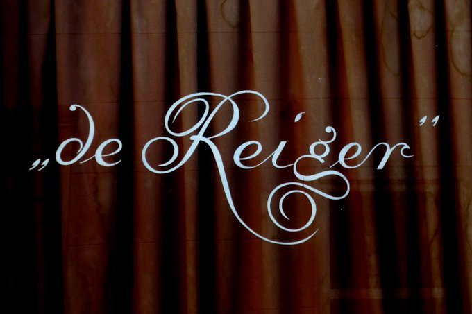
The image below shows the window of café „de Reiger” (the Heron). I imagine most people wouldn’t really have noticed it. Others may have noticed it but wouldn’t have given it much thought. Then there are people like Arno Verweij from Amsterdam Typography, who not only notices it, but takes the time to take a photo of it, edit it (I presume) and post it online for the enjoyment of other people like him and myself.
Maybe this says more about a graphic designer than autism, or more about me specifically, but I cannot glance at this picture and go on my merry way. No, I have been looking at this for 30 minutes already, and thoroughly enjoying every minute of it. It just captivates me.
The quotation marks make me wonder—why were they included? The drop terminal on ‘d’ and ‘g’ intrigue me, perhaps especially because normally you would not expect a drop terminal in ‘d’ at all, but you might expect one in ‘r’, but it has a sharp hook-like shoulder. I love the curly swashes in ‘R’, and I appreciate the sharp detail on the tittle (the dot) of ‘i’. But that ‘g’ is just astounding to me. Wow! But also, how amazing how the ‘R’ and ‘g’ come together
In terms of composition, the lettering is much denser on the right side. And yet it doesn’t feel unbalanced, maybe because that large decorated ‘R’ is positioned in the center, or just off-center to the left, to counteract the length and descend of the letters on the right side.
Looking at this, I also have very fond memories of a trip Natalie and I recently took to Halifax, Nova Scotia for a psychotherapy conference she was attending to learn a new trauma treatment. While she was at the conference, I explored the city, including the Old Burial Ground, which is a historic cemetery from 1749. I noticed quite a few gravestones with amazing chiseled lettering, and some very peculiar ‘g’ designs. I took photographs of all the ones I liked, intending to trace all the g’s and publishing them with the year of the gravestone in question. I don’t recall any of the g’s being as extravagant as what you see in the image above, but they are similarly unexpected and captivating.
Also, this may be farfetched, but the ‘g’ in the image above reminds me of the stacked double ‘s’ in the truly fascinating typeface Trickster by Jean-Baptiste Morizot (Phantom Foundry), as you can see in the image below. I suppose it’s because the loop of the ‘g’ looks like a swashy ‘s’ with an ‘o’ and an apostrophe stacked on top of it.

So yes. Lighting, textures, and details can often become too much when I am in a large store with fluorescent lighting. But at home in a dark room, visual information is what I am always looking for. I am always looking for shapes, colors, and combinations thereof that excite me and inspire me. And sometimes, I can’t let it go and keep thinking about it as long as my eyes can’t see it. Eccentric or not, that is me. Some may regard it as dysfunctional, but for me, it’s not only conducive to my career as a graphic designer, but it’s in fact the only way I know how to live.
There is no escaping my autism, but then nor do I want to. Except on Meltdown Mondays.
To explore the whole Sensory Sunday series,
have a look at the Sensory Sunday index:

Comments
Let us know what you think!